EmbeddingGemma 2: an open, lightweight multimodal embedding model
deepmind.google·6d ago
TL;DR
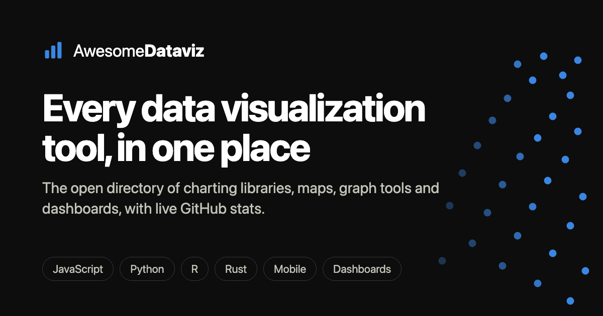
A new community-curated directory features 290 charting libraries and visualization tools, ranked daily based on live data from GitHub, npm, PyPI, and CRAN. Users can easily explore and compare tools by their popularity and category.
✦ Why It Matters
Explore this directory today to find the most popular visualization tools for your next project.
Key Takeaways
Full Summary
This directory aggregates 290 different charting libraries, mapping toolkits, and visualization tools, providing a comprehensive resource for developers and researchers. Each tool is represented as a dot on a log scale, with its position determined by the number of GitHub stars it has received, allowing users to quickly identify popular options.
Categories include JavaScript charting libraries like Chart.js and Plotly.js, graph visualization libraries such as Sigma.js, and geospatial tools like Leaflet. The data is refreshed daily, ensuring that the rankings reflect the most current trends in the developer community.
Users can hover over dots for more details and click to access the tools directly. This resource not only simplifies the search for visualization tools but also encourages community engagement in curating the list.
Related