EmbeddingGemma 2: an open, lightweight multimodal embedding model
deepmind.google·6d ago
TL;DR
CleanShot's recent version 5 update has significantly degraded its settings interface, losing usability and clarity compared to version 4. Users are encouraged to reconsider design choices that prioritize modern aesthetics over functional design.
✦ Why It Matters
Evaluate your software's design choices to ensure they prioritize user experience over mere aesthetics.
Key Takeaways
Full Summary
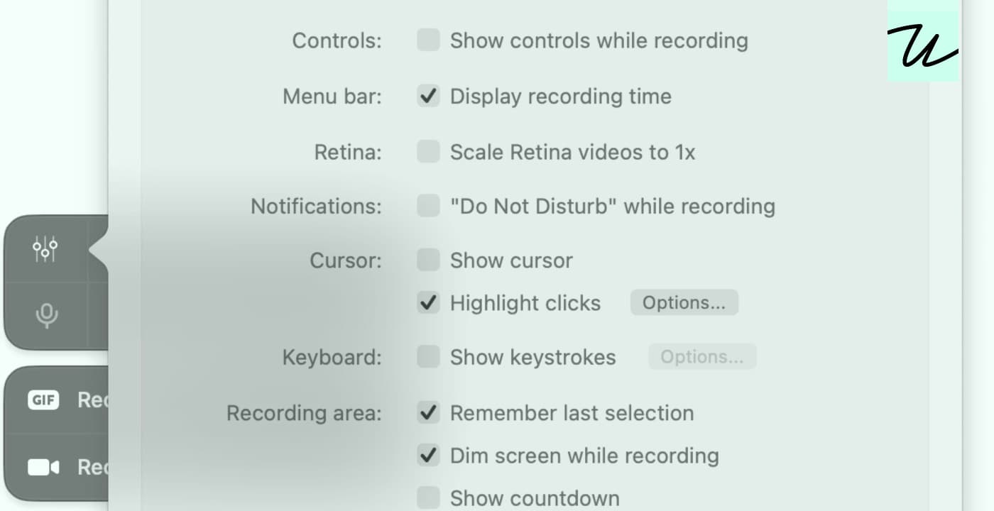
CleanShot's version 5 update has been criticized for 'bulldozing' its previously well-crafted settings interface, which was designed with user experience in mind. The redesign aimed to align with macOS's modern look but resulted in a confusing two-pane layout that disrupts visual processing.
Key issues include right-aligned labels that complicate navigation, a lack of recognizable shapes for orientation, and reduced usability due to narrower controls. Users can still downgrade to version 4, which maintained a more intuitive design.
The feedback highlights the importance of prioritizing user-centered design over aesthetic trends, especially when the operating system's own design choices are flawed. This situation serves as a cautionary tale for designers about the risks of sacrificing functionality for modernity.
Related